36 Ways to Create an Epic Event Website
March 14, 2024
The best event websites drive scores of registrations. They inspire your audience to click through, sign up, and get excited about attending. Although building an event website can feel daunting, this article is here to help. You’ll get 36 sure-fire tips and tools for websites that capture attention, delight visitors, and make them thrilled to participate in your event.
Let’s get started.

Keep user experience top of mind.
Your event website is your online storefront. It attracts attendees and engages them with helpful information about your event. So, make sure it delivers a stellar experiences from start to finish.
1. Choose a clean, modern design.
You want a site that’s visually appealing and easy to navigate. Intuitive navigation menus and a logical flow help users find the information they need effortlessly.
2. Pick a straightforward domain name.
Make it easy to remember and relevant to your event.
3. Link your website to your event tech stack.
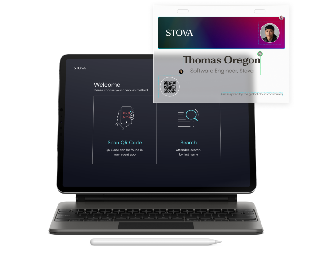
No more flipping back and forth between apps. Make life easy with a single platform streamlining the entire user experience, from registration to networking and onsite engagement.
4. See efficiency soar.
Ditch duplicate data entry. Modern Event Management Systems (EMS) integrate your agenda, speakers, sessions, and other event info automatically into your website.
5. Track behavior.
Use analytics and reporting tools to track visitors’ behavior. You’ll gain a goldmine of insights about their preferences. Leverage this intel to improve user engagement and event value.
6. Make your site mobile-friendly.
More than 60% of all Internet traffic comes from smartphones and tablets. A responsive design for mobile apps helps ensure your website works flawlessly across all devices.
7. Move fast.
Make sure pages load quickly. Slow-loading pages drive visitors away. By contrast, sites optimized for speed enhance the user experience. Plus, they can reduce bounce rates and improve search engine rankings.
8. Remember SEO.
Build a content-rich site optimized for search engines. Use keywords related to your event in your URL. Relevant keywords and clear meta descriptions help the right people find your site. Modern EMS solutions make building SEO-optimized websites easy.
9. Provide round-the-clock support.
Offer customer support through chat, email, and phone. Prompt answers enhance the user experience and build confidence in your event.
Share Essential Info
When visitors to an event website find information fast, they’re more likely to feel informed and confident in their decision to attend.
Don’t crowd your homepage with too many details. Stick to the essentials instead, like the dates, location, and registration link. You can always build separate pages for additional information, like the agenda, speakers, and sponsors. So, exactly what information should your website share?
10. Provide a structured event agenda.
Build a clear schedule of sessions, workshops, and networking events. Brief, informative descriptions let attendees know what to expect. Include speaker names, session titles, locations, dates, and times.
11. Think about offering an interactive schedule.
This way, attendees can personalize their agendas with ease.
12. Put your keynote speaker in the limelight.
Is a celebrity delivering your keynote? On your homepage, spotlight the speaker in an iconic photo with relevant, fast-loading video clips of past speeches.
13. Showcase your entire speaker lineup.
In a separate Speakers section, use bold, colorful images to spotlight all speakers. Include their names, titles, industries, and brief bios to demonstrate the quality of your event.
14. Write clear calls-to-action (CTAs).
Increase the odds that people will take the next step. Guide them through your event website with clear, concise CTAs like “Register now!” and “Download the agenda here.”
15. Place CTAs strategically.
Feature them on every page. For the homepage, include the CTA once “above the fold” to make it visible as soon as someone lands on the page. Place the CTA “below the fold,” too, after visitors scroll down.
16. Create Frequently Asked Questions (FAQs).
What if people have concerns about coming to your event? In FAQs, address common attendee questions and potential issues. This helps reduce barriers and boost registration.
17. Share contact information.
Clear communication channels and quick responses build trust. So, invite visitors to contact your team during business hours by phone or round-the-clock via email and chat.
Let stunning visuals build excitement.
A stellar website for events creates excitement and FOMO (fear of missing out). Grab attention with graphics, images, and videos that entice visitors to discover more.
18. First, make it easy.
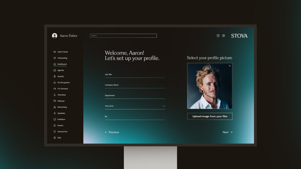
Modern EMS solutions let you create brandable websites with ease. Take advantage of pre-existing templates or create your own to reuse for multiple events.
19. Lead with a captivating hero banner.
Your hero banner at the top of your homepage is the doorway to start the journey. Ensure it commands attention and shares vital details at a glance, including your event name, dates, and location.
20. Use photos and videos from past events.
Or, if you’re hosting the event in a spectacular venue, let your hero banner showcase the space’s jaw-dropping visuals.
21. Say it loud.
When layering text across an image or video, make sure the text is high-contrast and readable against the backdrop.
22. Share stats.
Has your event wowed crowds in the past? Share its success in a scrolling parade of stats highlighting the number of attendees, speakers, sessions, and livestream views. You’ll draw eyes to your homepage and build credibility for this year’s conference.
23. Capture the spirit of your event.
High-quality visuals help you gain Instagram followers and boost engagement on other social channels. Make the most of high-quality images and videos showing enthusiastic attendees, dynamic speakers, and fun networking events.
24. Add sizzle.
Build anticipation with a sizzle reel or video highlights shining a light on thrilling aspects of your event.
25. Give a countdown.
Want to build urgency and encourage people to register now? Feature a countdown clock of the days, hours, minutes, and seconds until your conference starts. Place a “Register now” button next to the clock.
26. Welcome participation.
Epic events are immersive, so why should their websites be static? Bring your site to life with animation and interactive design features where they make sense. Your website will be “stickier,” encouraging visitors to spend time exploring the possibilities.
Make event registration and marketing a breeze.
Time-consuming processes turn people away. Make life easy with speedy registration and a seamless one-stop shop.
27. Keep your event registration form simple.
Limit the number of required fields. You only need a few details like name and email address.
28. Make registration mobile-friendly.
You’ll enable sign-ups anywhere, any time, on any device.
29. Offer different options.
Create discounts for early bird and group registrations to spur earlier sign-ups and higher turnout.
30. Make it seamless.
Powerful EMS solutions connect registration with your event website, reporting and other systems. No need to juggle different platforms or risk losing data moving back and forth between applications. You’ll save time and improve the attendee experience with a seamless one-stop shop.
31. Simplify marketing.
Linking the website to your event registration and CRM systems streamlines marketing. To boost attendance and build buzz, send targeted, branded emails by attendee type.
32. Pull reports at a moment’s notice.
Analyze registration progress in real time and see if you’re on track to hit your goals. You’ll gain valuable insights into what’s working (or not). Then, adjust your marketing and website content to ratchet up registrations.
Build credibility with social proof.
Social proof rests on the principle that people buy and engage with products their friends or peers recommend.
Proof on event websites comes in many forms. For example, you can use quotes, case studies and videos from past attendees, speakers, and industry influencers. Place these elements throughout your website to pique interest and build trust.
33. Mix it up.
Using a variety of formats adds interest. Event testimonials can be text-based alongside an image of the reviewer. Video is typically more engaging than text alone. Feature video testimonials showing reviewers participating enthusiastically in past events.
34. Add credibility.
Include the person’s name, title, and organization for each testimonial.
35. Allay concerns.
Make a list of possible obstacles to attendance. Is it price? Travel? Uncertainty about whether the event will generate business? Get positive, authentic feedback to ease concerns. Then, place testimonials strategically on your site, especially on the homepage and registration page.
36. Share far and wide.
Another best practice is to place social media share buttons throughout your site. With the click of a button, visitors can spread the word on their channels, helping you expand event reach.
Wrapping up
Consider these best practices and choose your top picks. With a high-performing event website, you can share valuable information, pique curiosity, excite your audience, and drive attendance through the roof. Curious to learn more about strategies captivate attendees? Watch our new webinar with Bizbash today! “Build Your 2024 Engagement Toolbox”
Whether your event is virtual, hybrid, or in-person, enhance your attendee’s journey with an event ecosystem built for your audience. Ready to walk through Stova's event technology solutions? Schedule some time with us today.

